Redesign a logo

  • Status: Closed
  • Prize: $20
  • Entries Received: 60
  • Winner: tineko

Contest Brief

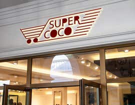
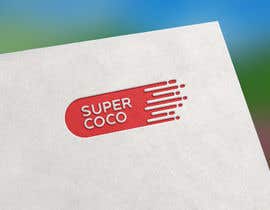
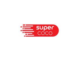
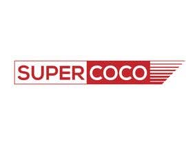
I need to redesign my current logo. It's for a supermarket, I attach a copy of my current design. The main goal is to mantain our character, but with a more modern look. Ideally the lines in the back -or some reference to them- should be mantained, perhaps only on one side, feathering the edges or changing the lengths, just let your imagination fly. The font should be simpler. Currently, the design is too complicated to make for example cutouts, 3d signs, etc.
Don't hesitate to post any doubts.

Recommended Skills

Employer Feedback

“Excellent! David did a wonderful job! Made a great first impression with his design and then perfectly understood all my requests. He was very quick to make the requested changes. I would definitely recommend him. ”

Profile image bryancasares, Argentina.

Top entries from this contest

View More Entries

Public Clarification Board

  • paek27
    paek27
    • 5 years ago

    #74

    • 5 years ago
  • paek27
    paek27
    • 5 years ago

    please check #68 , #69 , #70 , #71 , #72 , #73 .

    • 5 years ago
  • bryancasares
    Contest Holder
    • 5 years ago

    #55 WAY TO GO! Loved it, I'd only make some minor adjustments on the lines weight, to be more similar to the former logo. But wery good idea!

    • 5 years ago
  • tineko
    tineko
    • 5 years ago

    #guaranteed #guaranteed

    • 5 years ago
  • nssab2016
    nssab2016
    • 5 years ago

    dear contest holder. I really appreciate your judgement for some of the entries and the way you presented. thanks for such a nice idea

    • 5 years ago
  • bryancasares
    Contest Holder
    • 5 years ago

    Thanks everyone for your designs so far! Keep going!

    • 5 years ago
  • bryancasares
    Contest Holder
    • 5 years ago

    #10 I like that font, but too simple, need something that reminds of previous logo.

    • 5 years ago
  • bryancasares
    Contest Holder
    • 5 years ago

    #18 through #23 too modern, too much of a change form previous design.

    • 5 years ago
  • bryancasares
    Contest Holder
    • 5 years ago

    #2 looks pretty good too, maybe I'd change the font to something more "round".

    • 5 years ago
  • bryancasares
    Contest Holder
    • 5 years ago

    #32 #33 #34 : The overall idea is very good, I don't like the filled letters and not very fond of the cart. ¿Perhaps another font?
    #29 and #27 are fine, just concerned about making big signs in just one piece.

    • 5 years ago
  • vectordesign99
    vectordesign99
    • 5 years ago

    Please see my new update entries

    • 5 years ago

Show more comments

How to get started with contests

  • Post your contest

    Post Your Contest Quick and easy

  • Get tons of entries

    Get Tons of Entries From around the world

  • Award the best entry

    Award the best entry Download the files - Easy!

Post a Contest Now or Join us Today!