robinhossain94
Bangladesh

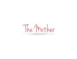
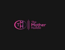
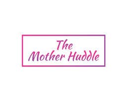
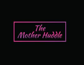
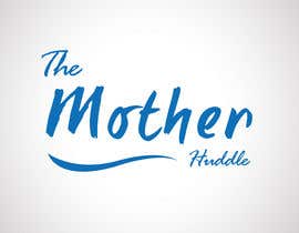
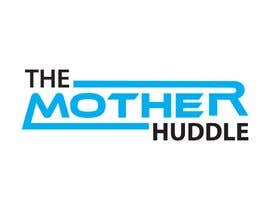
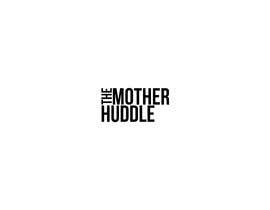
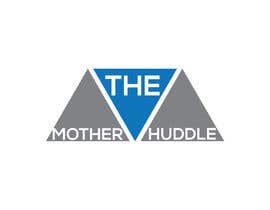
Hello, I am trying to bring a site back that hasnt been around since 2014 and want to recreate and modernize the old logo. I dont have a png of the logo but it can be found by going here: https://web.archive.org/web/20130406134808/http://www.themotherhuddle.com/
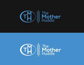
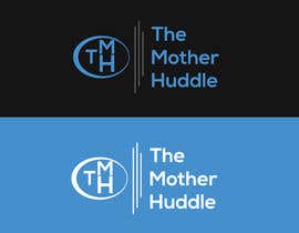
My biggest issue with the logo is its way to tall. As you see the theme im using here calls for a logo with less height: themotherhuddle.com.
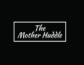
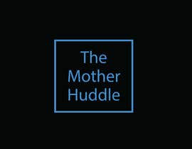
The site is a craft site so the logo should reflect this. You do not need to use the colors found in the old logo, and the colors you see on the live URL are just placeholders. Please make sure the logo includes "The Mother Huddle". I dont want the little orange "EST" part to remain with the new logo.
Please let me know if you have any questions!
“Robin created a great logo for me!”
![]() Ptasner, United States.
Ptasner, United States.


Post Your Contest Quick and easy

Get Tons of Entries From around the world

Award the best entry Download the files - Easy!