Freelancer: adi2381
Share:
Report Entry

entry

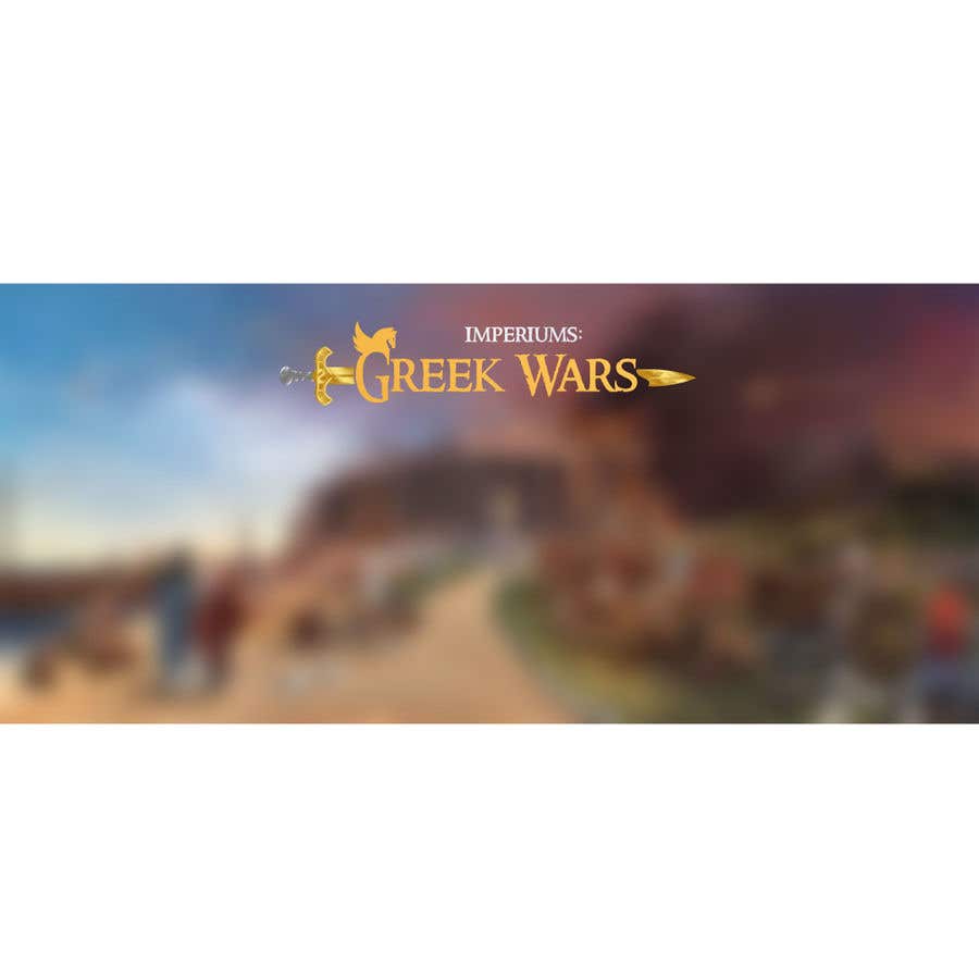
I tried to replicate the image, I also tried to make the sword feel really premium using gradient and shading. Hopefully, you will like this one better. I tried distinct colouring, it didn't look that appealing as compared to actual gradient mixing and shading.
Contest Entry #42 for                                                 Logo for video game

Public Clarification Board

  • LuciePav
    Contest Holder
    • 4 years ago

    The shape of the sword is good, but the colouring is not. It should be more sort of symbol without actual details.
    The shape of the ending (next to S) could be also better).
    The length of the sword is good now.

    • 4 years ago
  • adi2381
    adi2381
    • 4 years ago

    The curve of sword after S looks a bit crooked but that's due to the shape of the S so I think it will be better to let the sword stay as it is on S and add some more gap between sword and G.

    • 4 years ago