Logo Design

  • Status: Closed
  • Prize: $10
  • Entries Received: 3
  • Winner: hendyteguh

Contest Brief

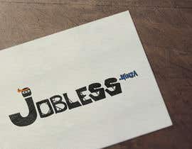
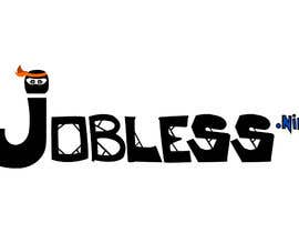
Update: I did say previously people can use commercial font as long as they tweak it and so far no one has attempted it. Therefore, I have created a design myself by hand, and hope someone can design a logo like the one I have provided. Vector trace it and do not 'convert' it using online services as it does not smooth the lines out or make it look nice. This will suit someone who is good at tracing the image I have provided. All lines should be smooth. If you just convert my image, it will be pixelated, so please, if you know someone can vector trace, please do.

The site is called:

jobless.ninja

The logo should have the word (in capital letters): JOBLESS.NINJA

***If you use a commercial font, you have to redraw parts onto the font to make it unique like my logo design- meaning the lettering needs to look 99% as thick as mine.

I am looking for a vector image - .ai, or .eps

Each letter should be on a seperate layer.

Colours combination I would like:

1. Colour scheme: Orange (darker orange and lighter orange), Black and White and blue (#243665)- keep it the same as my design.

***Ensure logo has transparent background.
*** All letters on a seperate layer.

I thank everyone who has participated, but the designs submitted in the past don't fit what I need. Right now I am looking for someone who can get the design 97% close to mine. Probably someone who can just vector trace the design of mine.


Thanks!

Recommended Skills

Top entries from this contest

View More Entries

Public Clarification Board

  • sjharvey
    Contest Holder
    • 3 years ago

    Thanks to everyone who participated. In the end it was between two people, but in terms of timing, one was nice enough to make sure I could check the quality of the vector.

    • 3 years ago
    1. shrikantsshinde
      shrikantsshinde
      • 3 years ago

      Congrats on the closure, Thanks for your valuable feedback on each entry, hardly I have seen any feedback from other contest holders, this will definitely increase the scope of improvement for budding designers.

      • 3 years ago
  • ShreeRupa04
    ShreeRupa04
    • 3 years ago

    Hello mam , i am working on it.. can i make it smooth?

    • 3 years ago
    1. sjharvey
      Contest Holder
      • 3 years ago

      My lines on the text I did is a bit wobbly, so yes please, I need the lines to be smooth. The curves should be nice curves and the straight lines should be straight lines. Try keep to my design if you can. Thanks!

      The reason I don't want people to use converting services online is because the colours are not done properly and when I designed the logo, I didn't fill it in properly either. Hence, a trace of the design and the colours should stay the same, but lines should be smooth and curve properly where it needs to be curved.

      • 3 years ago
  • smasifali75
    smasifali75
    • 3 years ago

    Thank you

    • 3 years ago

Show more comments

How to get started with contests

  • Post your contest

    Post Your Contest Quick and easy

  • Get tons of entries

    Get Tons of Entries From around the world

  • Award the best entry

    Award the best entry Download the files - Easy!

Post a Contest Now or Join us Today!