Graphic for web

  • Status: Closed
  • Prize: $20
  • Entries Received: 3
  • Winner: hsahu003

Contest Brief

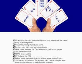
I need a graphic similar to the attached to accompany my Web site that says 'All software products are at your fingertips'.
Please feel free to submit, any other concept that illustrates the above, instead of the one shown on the attached graphic and also described below.:

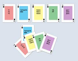
Basically, 5 cards and a couple of fingers on a JPG and/or other format suitable for web
Differences from supplied sample

- Each card will have one of the Royal Flush suite card letters: A, K, Q, J, 10 (Royal Flush is the winning combination of cards in Card playing): So the first card on the right will have A at the top left and also A on the bottom right. The second will have K, etc.
- Each card will have the software Product codes in the center or any other space visible in the graphic of each card: (vertical or horizontal) as described below:
Card 1: T1, T2, T3
Card 2: T4/T4A/T5, NR4
Card 3: T3010, T5013, T5018...
Card 4: TR, FP
Card 5: Prior Years

The cards need to be spaced properly.


Differences:

Recommended Skills

Employer Feedback

“I am very happy with the professional attention, attitude and the results I received. Hemendra S. demonstrated also a very high degree of patience and willingness to address some requested changes to the initial version of the graphic. For any similar work, I would recommend Hemendra S. with no hesitation.”

Profile image johnzant, Canada.

Top entries from this contest

View More Entries

Public Clarification Board

  • johnzant
    Contest Holder
    • 5 years ago

    Comments after I saw the full picture:
    - No words or banners on the background, we only need the fingers and the cards.
    - The color of the background could be navy blue.
    - See if you can use horizontal placing of 'Prior' and second line 'Years' so it is easier to read. Do not use full capital letters.
    - The color of the card letters A, K, Q, J, 10 could stay red but the products should be bold dark blue and bigger.
    - Leave more space between the Card letters and the Product names i.e. place product names a bit lower.
    - Card A: Try placing T1, T2, T3 in the middle of the card horizontally. Do it only if it looks ok.
    - Ensure the T4A, NR4 re fully visible. Currently I cannot clearly read their full names
    - T5018 is not fully visible. NOTE: You can put the Q products on Card J and FP, TR on Card 2 if it makes it easier due to the way the space is.
    - Card J, or Q: Put FP first and then TR

    • 5 years ago
    1. hsahu003
      hsahu003
      • 5 years ago

      submitting the files with modification soon

      • 5 years ago
  • kartikhatana
    kartikhatana
    • 5 years ago

    Hello Sir dont announce the winner yet i am working on it

    • 5 years ago
  • johnzant
    Contest Holder
    • 5 years ago

    I may have a use for the original image you send me with the banner. But first change the cards as described in my previous comments. Then change the banner to read 'All tax modules at your fingertips' in two lines as you ha it. Do not emphasize the 'fingertips' and remove 'the Know more'.

    • 5 years ago
  • johnzant
    Contest Holder
    • 5 years ago

    No words or banners on the background, we only need the fingers and the cards. The color of the background could be navy blue. The color of the background should be easy to change with which tool?). dark I cannot tell right now as I only see the left side. See if you can use horizontal placing of 'Prior Years'. Also: Allow bigger space for the cards (and a bit less space for the fingers?) so the product names will be readable in our web site presentations. The color of the card letters A, K, Q, J, 10 could stay red but the products should be bold dark blue and bigger. Leave more space between the Card letters (i.e between 10 and Prior Years) in all cards. I cannot see the A card but I am assuming the products would be in the middle as T1, T2, T3 and it would have the A on the right end corner also.

    • 5 years ago
    1. hsahu003
      hsahu003
      • 5 years ago

      are you there? I am working on this.

      • 5 years ago
    2. hsahu003
      hsahu003
      • 5 years ago

      can you please explain this line ". I cannot see the A card but I am assuming the products would be in the middle as T1, T2, T3 and it would have the A on the right end corner also."

      • 5 years ago
  • johnzant
    Contest Holder
    • 5 years ago

    No words or banners on the background, we only need the fingers and the cards. The colour of the background could be navy blue. The color of the background should be easy to change with which tool?). dark I cannot tell right now as I only see the left side. See if you can use horizontal placing of 'Prior Years'. Also: Allow bigger space for the cards (and a bit less space for the fingers?) so the product names will be readable in our web site presentations. The color of the card letters A, K, Q, J, 10 could stay red but the products should be bold dark blue and bigger. Leave more space between the Card letters (i.e between 10 and Prior Years) in all cards. I cannot see the A card but I am assuming the products would be in the middle as T1, T2, T3 and it would have the A on the right end corner also.

    • 5 years ago
    1. hsahu003
      hsahu003
      • 5 years ago

      text and banner are just for mockup purpose. I will only provide you the main image.

      • 5 years ago
  • johnzant
    Contest Holder
    • 5 years ago

    So some of my comments may not apply. Now I can see the full message and the full suite of cards. I will study it again and by tomorrow night I will have my comments. It is a bit late right now to do it. It is 12 at night! where I live. Thank you

    • 5 years ago
    1. hsahu003
      hsahu003
      • 5 years ago

      hello, how are you doing? I am waiting for your comments. just describe the changes you want to see in the design more clearly then I will update it accordingly. Thanks.

      • 5 years ago
  • johnzant
    Contest Holder
    • 5 years ago

    For some reason The first time I saw it, it showed only part of it.

    • 5 years ago
  • johnzant
    Contest Holder
    • 5 years ago

    -Good start.

    • 5 years ago
  • hsahu003
    hsahu003
    • 5 years ago

    hey there, do you want something specific in background ?

    • 5 years ago

Show more comments

How to get started with contests

  • Post your contest

    Post Your Contest Quick and easy

  • Get tons of entries

    Get Tons of Entries From around the world

  • Award the best entry

    Award the best entry Download the files - Easy!

Post a Contest Now or Join us Today!