Design an Icon and Intro Screen for Mobile App
- Status: Closed
- Prize: $150
- Entries Received: 70
- Winner: assamite

Contest Brief
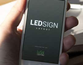
Mobile App Name: LED Sign Layout
Mobile App Demographic/Users: Our app will be used by Sign shop manufacturers. They produce the electronic signs (with tiny LED lights) that are usually on the outside of a business or store. For example the McDonalds or Walmart sign.
Mobile App Description: The application will calculate the quantity of LED lights required using our product specifications. In short, the user will be able to insert the text or size of the sign and it will calculate the quantities of lights required to build the sign.
-Part 1: Into Screen Design Requirements
-The intro logo screen will have the name of the app only. We would like the logo to look clean professional l look. Logo must be flexible to work with future sub-branding. We invite the community to suggest our artistic direction.
-Intro Screen Size requirements: 2208 x 1242 pixels (Keep in mind this is the total size of the image, not the required size of the logo.)
-Format: Bitmap
-Part 2: Icon
-Icon color scheme should match the look of the logo. Simple but intuitive design is preferred, however as the logo we are trying to keep it as open as possible.
-Icon Size Requirements: 1024 x 1024 pixels
-Format: Bitmap
*6-27-15 EDIT*
For more background information/ideas please look up on google images the following two phrases:
LED Modules
Channel Lettering
-Please provide both the full size screen and the Icon image. They are not required to be the same image. (Comments above regarding that the icon scheme should match the intro screen means if one is using a pastel pallet, the other should definitely NOT be in a neon pallet.)
-Please have the mobile app name (LED Sign Layout) on the intro screen.
*6-29-15 EDIT*
For inspiration, I've added some SAMPLE pictures of what channel lettering looks like. There are three types of signs, Reverse Lit, Forward Lit, and Both Forward and Reverse Lit. The other picture shows a worker installing the LED modules into the sign so they can light up.
*7-4-15 EDIT*
We would like to note to our contests that our preference of colors are Yellow for warmth, Blue for trust, and Green for peacefulness. We've also noted that our company uses color #006738 but implementation of this color is NOT required. Also note again that any logos showing the traditional diode symbol will be rejected.
*7-9-15 EDIT*
Added our company logo. Please implement our logo into your splash screen. For example, LuSol Lighting Proudly Presents LED Sign Layout, or LED Sign Layout Presented By LuSol Lighting.
Thank you for all your entries.
Good luck.
Recommended Skills
Employer Feedback
“Good designer. Listens and tries to understand all the requirements and provides updates as requested. Recommended. ”
![]() lusollighting, United States.
lusollighting, United States.
Public Clarification Board
-

jessebauman
- 8 years ago
willing and ready to make any changes needed please let me know if you have any suggestions thanks.
- 8 years ago
-
jessebauman
- 8 years ago
- 8 years ago
-
NEXTIN
- 8 years ago
- 8 years ago
-
NEXTIN
- 8 years ago
Please check ' #155
- 8 years ago
-
NEXTIN
- 8 years ago
Please check #154
- 8 years ago
-
NEXTIN
- 8 years ago
PLease check #153
- 8 years ago
-
NEXTIN
- 8 years ago
Check the entry #135 with your new logo & brand idea :)
- 8 years ago
-
jessebauman
- 8 years ago
#132 *
- 8 years ago
-
jessebauman
- 8 years ago
hellow please see # 132 thanks.
- 8 years ago
-
NEXTIN
- 8 years ago
See #135 !!
- 8 years ago
-
NEXTIN
- 8 years ago
Sir,have a look at #134
- 8 years ago
-
jessebauman
- 8 years ago
Please check #132
- 8 years ago
-

zradit
- 8 years ago
new from #123 :)
- 8 years ago
-

Contest Holder - 8 years ago
Again we thank all the contestants for submitting entries. We realize the difficulty for having such broad requirements on a subject that's not easily understood. It was difficult to narrow down the contestants but we have provided feed back for jessebauman, NEXTIN, and assamite whose work most resembles our direction. We've added our company logo in the brief to be added to the intro screen. With only 2 days left, feed back for the rest of the contest will be very limited. We wish anyone still participating the best of luck.
- 8 years ago
-
jessebauman
- 8 years ago
please see #130 thanks.
- 8 years ago
-

freek26davidson
- 8 years ago
please check #125
- 8 years ago
-

silentkiller926
- 8 years ago
please rate #121
- 8 years ago
-
kimkhoy
- 8 years ago
- 8 years ago
-
jessebauman
- 8 years ago
thanks for the valuable feedback please see #113 thanks
- 8 years ago
-
Contest Holder - 8 years ago
We gathered another round of feedback from the team and tried to clean up duplicates or reject entries that we felt needed work. We apologize if we are blunt/frank in our feedback as we've tried to provide feedback for every entry (very time consuming). Overall we are impressed with the output and quality that has been presented to us and want to thank everyone whose submitted as it makes it even more difficult to judge.
- 8 years ago
View 1 more message
-
silentkiller926
- 8 years ago
#108
- 8 years ago
-
jessebauman
- 8 years ago
strongly recommend against using a icon that features a brick wall backgroung or any image on the icons background this will cause alot of problems later on in your development.
- 8 years ago
-
jessebauman
- 8 years ago
mostly just because the scaling will reduce the image into just pixels for best quality you Need a complete vector image on the icon.
- 8 years ago
-
jessebauman
- 8 years ago
unless of course the image used has been vectorized but even at that it then becomes a much larger file and a mess. if you would like to see a high quality vector wall background or stone i can make that for you so it wont conflict with the guidelines
- 8 years ago
-
jessebauman
- 8 years ago
this may help a bit here is some ios guide lineshttps://developer.apple.com/library/ios/documentation/UserExperience/Conceptual/MobileHIG/AppIcons.html
- 8 years ago
-
jessebauman
- 8 years ago
- 8 years ago
-
freek26davidson
- 8 years ago
please check #105
- 8 years ago
-

VincenzoDesign
- 8 years ago
Hello,
Please review my work #94- 8 years ago
-
Contest Holder - 8 years ago
Will get together with the team to provide feed back in about 7 hours from now. We've added some pictures of inspiration to help show the different types of signs and one picture of a worker installing the LED's into the sign. Good luck.
- 8 years ago
-
kimkhoy
- 8 years ago
sir check my new entry #101
- 8 years ago
-
VincenzoDesign
- 8 years ago
Hello,
Please review my work #94- 8 years ago
-
jessebauman
- 8 years ago
Please see #104
- 8 years ago
-
kimkhoy
- 8 years ago
CHECK #101 and 103 sir!
- 8 years ago
-
jessebauman
- 8 years ago
i strongly recommend against using a icon that features a brick wall backgroung or any image on the icons background this will cause alot of problems later on in your development.
- 8 years ago
-
VincenzoDesign
- 8 years ago
Hello,
Please review my work #94- 8 years ago
-
jessebauman
- 8 years ago
please check #86
- 8 years ago
-
jessebauman
- 8 years ago
- 8 years ago
-
NEXTIN
- 8 years ago
Please check #81
- 8 years ago
-
jessebauman
- 8 years ago
please check #38 thanks
- 8 years ago
-
Contest Holder - 8 years ago
We've reviewed all the entries so far and have left only 5 to help the contestants see some of our likes and dislikes. They have been chosen based on: That they followed directions on presentation, Creativity, and Professional look. There's still plenty of time to submit. Keep at it. We'll be trying to provide feedback as much as we can. Good luck.
- 8 years ago
-
Contest Holder - 8 years ago
Tried to give feedback and rate based on whats currently presented. What I liked is #3's presentation showing me both how the intro screen looks like and ALSO how the icon looks like. I noticed #3 and #8 used shading to look like they are lighted, based on that, we think we might be interesting in seeing a design implementing channel lettering, or reverse channel lettering into the name. Keep up the good work.
- 8 years ago
-
jessebauman
- 8 years ago
please have a look at #19 thanks
- 8 years ago
-
Contest Holder - 8 years ago
Updated contest brief. Please note that while I used the term LED lights to simplify the verbiage of the brief none of the products use the old traditional style of LED so I'm not sure the traditional LED symbol will connect with our customer base.
- 8 years ago
-

janpizzuti
- 8 years ago
I agree, please post an image of the product.
- 8 years ago
-
Contest Holder - 8 years ago
Looks like I forgot to press enter on the response. We have not determined if the second phase of our program to contain our affiliate products and possibly even competitors. So we think that it would be best to keep the icon and intro screen product neutral.
- 8 years ago
How to get started with contests
-

Post Your Contest Quick and easy
-

Get Tons of Entries From around the world
-

Award the best entry Download the files - Easy!