Design a Logo
- Status: Closed
- Prize: R500
- Entries Received: 26
- Winner: arisabd

Contest Brief
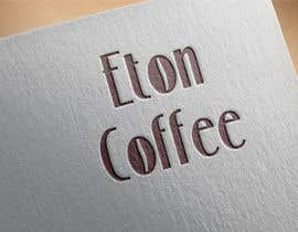
I have a company called ''Eton Coffee" and its an upmarket drive through coffee house. Something cool, upmarket with a bit of a twist! Thank youuuuuu:-)
Recommended Skills
Employer Feedback
“Hi, Just need logo 4 as the final files. Thanks! Also, how do I contact you from now on - can you add me to your contact list? ”
![]() adrian051, United Kingdom.
adrian051, United Kingdom.
Public Clarification Board
-

arisabd
- 7 years ago
I will deliver my design in vector files (ai, eps, pdf, cdr) and bitmap (png, jpg, gif) if you choose my design, also revision color as you ask.
- 7 years ago
View 6 more messages
-

Contest Holder - 7 years ago
hello?
- 7 years ago
-
Contest Holder - 7 years ago
Just to clarify that I love the logo 'Eton Coffee' with the two 'O' in the shape of a coffee bean. If you could try to use the colours blue and gold ad I will be targeting an upmarket following for my brand. If you think of Eton school you will be along the correct track:-)!
- 7 years ago
-

skydream7
- 7 years ago
Hello Sir
- 7 years ago
-
Contest Holder - 7 years ago
The winner I selected never delivered the correct files. Freelancer have relaunched the contest and I will pick the winner quickly.
- 7 years ago
-
Contest Holder - 7 years ago
Hi all,
- 7 years ago
-
Contest Holder - 8 years ago
51 and 52 are amazing but the 'E' needs to look more like an 'E' - hope that makes sense!
- 8 years ago
-
Contest Holder - 8 years ago
No 45 - can you write 'eton coffee' so the eton is on top and the coffee is below it?
- 8 years ago
-

richardginn
- 8 years ago
If you like the eton on top with coffee on the bottom I have put my two best submissions into one entry here for entry #47 so you can see how it looks.
- 8 years ago
-
arisabd
- 8 years ago
I've changed my design like your suggestion Sir, let you check it.
- 8 years ago
-
arisabd
- 8 years ago
Please kindly check #42- #45 Sir,
- 8 years ago
-
Contest Holder - 8 years ago
I'm really like 31 and 37!
- 8 years ago
-

kahaium
- 8 years ago
Hope #40 will make your expectation bigger
- 8 years ago
-

VMJain
- 8 years ago
plz check #41
- 8 years ago
-
VMJain
- 8 years ago
plz check #38
- 8 years ago
-
VMJain
- 8 years ago
plz check #37
- 8 years ago
-

daryatwiggy
- 8 years ago
- 8 years ago
-
MdZohan
- 8 years ago
- 8 years ago
-
kahaium
- 8 years ago
Any correction for select #17
- 8 years ago
-

flynnrider
- 8 years ago
Please check #22
- 8 years ago
-
richardginn
- 8 years ago
I did a flat design for #14 does that smarten it up??
- 8 years ago
-
richardginn
- 8 years ago
I also did #19 that has a bit of a gradient to it.
- 8 years ago
-

RomyTimmermanns
- 8 years ago
Could you leave recommendations on #13
- 8 years ago
-
Contest Holder - 8 years ago
RichardGinn - great idea, can you just smarten it up and use the recommended colours:-)
- 8 years ago
-
kahaium
- 8 years ago
Want to know your opinion about #11
- 8 years ago
-
Contest Holder - 8 years ago
No need for the cup of coffee :-)
- 8 years ago
-
Contest Holder - 8 years ago
I love the idea that richardginn used the ''o'' as a coffee bean, I'd love both ''o'' to have the coffee bean design. I would love the logo to look a bit smarted that this initial design. Can you please play around with the colours red, yellow, orange and brown
- 8 years ago
-
RomyTimmermanns
- 8 years ago
Any colors you would like to use? And would you like me to include a cup of coffee?
- 8 years ago
-
Contest Holder - 8 years ago
serious
- 8 years ago
-
shrewdtech
- 8 years ago
cartoon logo or serious ?
- 8 years ago
How to get started with contests
-

Post Your Contest Quick and easy
-

Get Tons of Entries From around the world
-

Award the best entry Download the files - Easy!