Design a life wheel

  • Status: Closed
  • Prize: $30
  • Entries Received: 63
  • Winner: jeevanmalra

Contest Brief

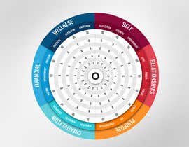
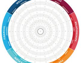
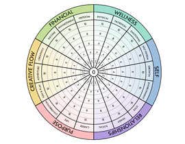
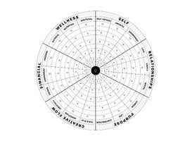
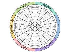
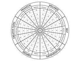
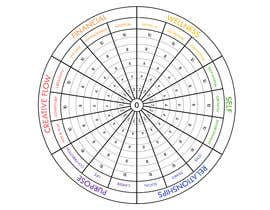
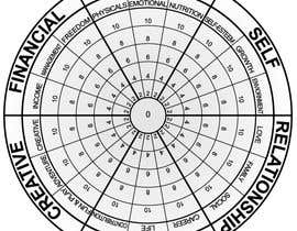
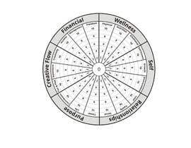
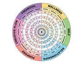
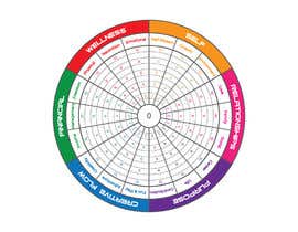
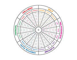
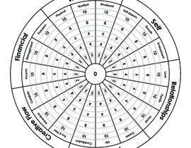
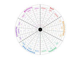
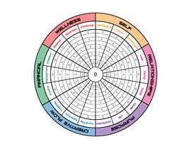
I need someone to design a life wheel, similar to the design attached here.

The categories I want are divided into 6 outer arcs, each with 3 specific slices of the pie:

1. Wellness
1.1 Physical
1.2 Nutrition
1.3 Emotional

2. Self
2.1 Self-Esteem
2.2 Growth
2.3 Environment

3. Relationships
3.1 Love
3.2 Family
3.3 Social

4. Purpose
4.1 Career
4.2 Life
4.3 Contribution

5. Creative Flow
5.1 Fun & Play
5.2 Adventure
5.3 Creativity

6. Financial
6.1 Income
6.2 Management
6.3 Freedom

The inner scale should be 0 to 10

This is used in workshop environments and will be printed (A4 and/or A3 size) so that participants can draw their personal results onto it. It will also be used in slides / presentations and videos. All in either black and white or colour usages. The design needs to be suited to use in all those contexts.

I want the final deliverable to be ideally in PSD with layers so that I can edit the text/labels in the future if required.

Recommended Skills

Employer Feedback

“Great work. Thanks”

Profile image aaronbirkby, Australia.

Top entries from this contest

View More Entries

Public Clarification Board

  • Gunjan999
    Gunjan999
    • 5 years ago

    Could anybody please let me know why my entry was rejected stating entry contains stock imagery but i made it from scratch.

    • 5 years ago
  • syedhoq85
    syedhoq85
    • 5 years ago

    pls check #67 , #69 & #71

    • 5 years ago
  • perfectdesign188
    perfectdesign188
    • 5 years ago

    Please check my entry#90

    • 5 years ago
  • Rodrogo
    Rodrogo
    • 5 years ago

    Please check my entry #85 #84 #83 .... thanks

    • 5 years ago
  • Asrafulmd
    Asrafulmd
    • 5 years ago

    please check #82

    • 5 years ago
  • saeidalam12344
    saeidalam12344
    • 5 years ago

    Please check my work #77 #78 & #79

    • 5 years ago
  • syedhoq85
    syedhoq85
    • 5 years ago

    Working on it, pls dont closed earlier, thank

    • 5 years ago
  • lookandfeel2015
    lookandfeel2015
    • 5 years ago

    #57

    • 5 years ago
  • lookandfeel2015
    lookandfeel2015
    • 5 years ago

    #55

    • 5 years ago
  • lookandfeel2015
    lookandfeel2015
    • 5 years ago

    #50

    • 5 years ago
  • emin7
    emin7
    • 5 years ago

    Please check #29 #33 #37

    • 5 years ago
  • shelovesart
    shelovesart
    • 5 years ago

    Dear contest holder, kindle check my entries #42 , #43 , #44 . Thank you.

    • 5 years ago
  • tumpatahmina2018
    tumpatahmina2018
    • 5 years ago

    Please check #30 #31 #32 #39. Thank you

    • 5 years ago
  • Asrafulmd
    Asrafulmd
    • 5 years ago

    working

    • 5 years ago
  • webdesignmilk
    webdesignmilk
    • 5 years ago

    Please check #26 , #24

    • 5 years ago
  • aaronbirkby
    Contest Holder
    • 5 years ago

    I wonder what it would be like to see light shading of the bigger slices (ie each grouping of 3) in the central area, but only very faint.

    • 5 years ago
  • aaronbirkby
    Contest Holder
    • 5 years ago

    Hey everyone. Just one note, that these will be used by participants in workshops in printed form to complete (colour or line) their status against each slice of the pie. Therefore, having the central area of the circle be pretty light / faint (rather than full colour in the centre) is very useful. It also needs to be very easy to read.

    • 5 years ago
  • lookandfeel2015
    lookandfeel2015
    • 5 years ago

    #21

    • 5 years ago
  • webdesignmilk
    webdesignmilk
    • 5 years ago

    Please check #19

    • 5 years ago
  • ioanacondrea
    ioanacondrea
    • 5 years ago

    Thank you! I'll work on it now.

    • 5 years ago
  • aaronbirkby
    Contest Holder
    • 5 years ago

    Basically I want it to be very easy to read

    • 5 years ago
  • aaronbirkby
    Contest Holder
    • 5 years ago

    Design #7 is my favourite so far. I would like to see versions where all the text labels are black rather than colour (although I like the numbers and central lines being a lighter grey). I also wonder if it would be better to lightly shade the slices into their categories (I'm not sure).

    • 5 years ago
  • LizaRani
    LizaRani
    • 5 years ago

    do you need totally similar?

    • 5 years ago

Show more comments

How to get started with contests

  • Post your contest

    Post Your Contest Quick and easy

  • Get tons of entries

    Get Tons of Entries From around the world

  • Award the best entry

    Award the best entry Download the files - Easy!

Post a Contest Now or Join us Today!