Create a Logo (1 x 1 layout)

  • Status: Closed
  • Prize: $25
  • Entries Received: 27
  • Winner: nilaraj1

Contest Brief

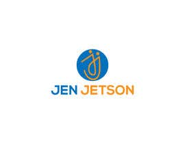
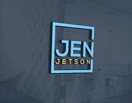
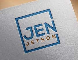
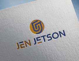
It is for the brand name Jen Jetson. This logo should look stylish, convey intelligence, technology, and probably use blue as a main color. It should not be overly masculine.

Currently, the attached logo is the one I am using. It was meant to resemble the Pi Symbol but I created it myself and I am not a graphic designer. I think I want the logo to have the letters JJ on it.

I do like blue and orange together and something that is eye catching and plays off contrast colors.

I do want 1x1 size that is rounded on the corners so it can be used in profiles, etc. Please submit an .AI file so I can export sizes and create different formats.

NOTE: It needs to be recognizable at very small sizes. (Like an avatar, profile, or even fav.ico).

Recommended Skills

Employer Feedback

“She read the instructions in the contest and nailed the submission. Her design was fresh and stylish. The file hand-off went perfect and I received the .AI files I requested (and all other formats, too). 100% satisfied! Thank you”

Profile image stylopress, United States.

Top entries from this contest

View More Entries

Public Clarification Board

  • stylopress
    Contest Holder
    • 4 years ago

    #18 the other style was better. I like how you did #13. If the design in the circle was a little less generic (unbranded), this one would be 5 stars to me.

    • 4 years ago
    1. mstalza323
      mstalza323
      • 4 years ago

      okay

      • 4 years ago
  • stylopress
    Contest Holder
    • 4 years ago

    #16 could you make that work in a circle? I like it a lot!

    • 4 years ago
  • stylopress
    Contest Holder
    • 4 years ago

    #10 --cont'd the font on the bottom is not right for me, though. I like clear, legible, clean, bold.

    • 4 years ago
  • stylopress
    Contest Holder
    • 4 years ago

    #10 I like what you did with the design in the circle. It is really close to what I'm thinking about. A stylish JJ.

    • 4 years ago
  • stylopress
    Contest Holder
    • 4 years ago

    #7 i like the colors and the idea it just needs to be tighter.

    • 4 years ago
    1. mstalza323
      mstalza323
      • 4 years ago

      Thank you

      • 4 years ago
  • ayonholmes13
    ayonholmes13
    • 4 years ago

    please check it out . No-1

    • 4 years ago
    1. stylopress
      Contest Holder
      • 4 years ago

      I like the idea of the top circle with the bottom words. I don't like the middle JJ because it reminds me of Adobe.

      • 4 years ago
  • stylopress
    Contest Holder
    • 4 years ago

    #9 even though not perfect 1:1 i can remove the word Jen Jetson and it still would be. That is okay with me cuz I could use the logo two ways (with and without the Jen Jetson).

    • 4 years ago
  • stylopress
    Contest Holder
    • 4 years ago

    #5 is 1 star because it cannot be read at a small size. Think of something that you can recognize at fav.ico size.

    • 4 years ago
  • stylopress
    Contest Holder
    • 4 years ago

    #4 is 1 star because it is not 1x1

    • 4 years ago
  • stylopress
    Contest Holder
    • 4 years ago

    #2 is 1 star because it's not 1x1

    • 4 years ago

Show more comments

How to get started with contests

  • Post your contest

    Post Your Contest Quick and easy

  • Get tons of entries

    Get Tons of Entries From around the world

  • Award the best entry

    Award the best entry Download the files - Easy!

Post a Contest Now or Join us Today!