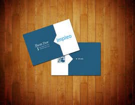
Business Card Design for Impleo
- Status: Closed
- Prize: $290
- Entries Received: 18
- Winner: StrujacAlexandru

Contest Brief
Clean, professional business card design
Recommended Skills
Employer Feedback
“Flexible and professional designer. I would be even more impressed if he could've delivered the work in vectorformat.”
![]() ot2, Norway.
ot2, Norway.
Public Clarification Board
-

zhmunna3
- 12 years ago
Congratulation @StrujacAlexand
You done a great job.- 12 years ago
-

Contest Holder - 12 years ago
.
- 12 years ago
-
Contest Holder - 12 years ago
Thanks to all participants. We did not really totally agree internally, but ended up with #119 . Even though there has been some TOTALLY useless designs there were a lot of really professional submissions.
We might hold another contest for other designwork within a week or two.- 12 years ago
-

radunicolae
- 12 years ago
I look forward for another chance :D
- 12 years ago
-
radunicolae
- 12 years ago
Congratz Alex.
- 12 years ago
-

azizdesigner
- 12 years ago
please check #91 #21 #22
thanks.- 12 years ago
-

csgokul
- 12 years ago
CH , Feedbacks for #88 , #96 , #115 pls ...
- 12 years ago
-
radunicolae
- 12 years ago
Hi,
Please check #82, #83
Thanks- 12 years ago
View 1 more message
-
radunicolae
- 12 years ago
Many thanks.
- 12 years ago
-
radunicolae
- 12 years ago
Please check #120
Thanks- 12 years ago
-

maazalisyed
- 12 years ago
#113 and #112
- 12 years ago
-
azizdesigner
- 12 years ago
please check #91
- 12 years ago
-

moncho37
- 12 years ago
Hi
What you think of #105 #102 #103?
Thanks Have a great day- 12 years ago
-
Contest Holder - 12 years ago
Some of my collegues wanted darker blue, which migh be your #102 , but they also disliked the thin boxes with information in them. I personally like the speech-bubble-concept, but my collegues disagreed... It's not easy to find something everybody likes.
- 12 years ago
-

redstep
- 12 years ago
Hi. Just submitted my new entries. May I ask what happened to my previous designs? Thanks.
- 12 years ago
-
Contest Holder - 12 years ago
Your suggestion was rejected after a massive joint rejection-round after lunch today. Cannot give you a very good explanation other than some of my collegues disagreed with my taste. :
Your new designs will be evaluated now.- 12 years ago
-
talehkarimli
- 12 years ago
hi , can you check #111
- 12 years ago
-
jrjan
- 12 years ago
please check #93
- 12 years ago
-
Contest Holder - 12 years ago
Gradients and seems a bit unreadable.
- 12 years ago
-

StrujacAlexandru
- 12 years ago
please check #99 . Thank you
- 12 years ago
-
Contest Holder - 12 years ago
Not as good as your other designs.
- 12 years ago
-

khrakib
- 12 years ago
Please rate #104
- 12 years ago
-
Contest Holder - 12 years ago
I've already said I dislike the use of gradients. And our logo was attached for a reason.
- 12 years ago
-
azizdesigner
- 12 years ago
please check #91
- 12 years ago
-
csgokul
- 12 years ago
CH ... #79 ...
- 12 years ago
-

markkarolo
- 12 years ago
Hi,
Added #60 - I took a minimal, sophisticated approach to push forward your brand and help connect with your target market- 12 years ago
-
Contest Holder - 12 years ago
Logo on the front seems a bit large.
- 12 years ago
-
markkarolo
- 12 years ago
Thanks for the feedback, revised to #71
- 12 years ago
-

elindana
- 12 years ago
sir, please check #68..
thx. :D- 12 years ago
-
Contest Holder - 12 years ago
We are going through all submitted designs today and can hopefully reject a lot more designs after that meeting. My collegues might have different opinions than me regarding the designs. Hope to award a winner today or tomorrow morning.
- 12 years ago
-
azizdesigner
- 12 years ago
Hi Kindly check #56 and #57 and let me know your feedback.
thanks- 12 years ago
-
Contest Holder - 12 years ago
#57 looks better than #56.
- 12 years ago
-
azizdesigner
- 12 years ago
Please give me some idea or reference to improve it.... What do you suggest to improve it more...?
- 12 years ago
-

renatobreda
- 12 years ago
Just added a new design #59
Thanks....- 12 years ago
-
Contest Holder - 12 years ago
A bit more balanced now, but still is something that doesn't quite do it. Logo might be a bit large and having it on both sides at that size seems too much.
- 12 years ago
-
StrujacAlexandru
- 12 years ago
#62 and #63 too
- 12 years ago
-
Contest Holder - 12 years ago
Missing title here as well. #62 looks better than #63 I guess.
- 12 years ago
-
StrujacAlexandru
- 12 years ago
Hi,
please check #61
Thank you.- 12 years ago
-
Contest Holder - 12 years ago
Looks good.
Missing title-field, but apart from that nothing to comment.- 12 years ago
-
azizdesigner
- 12 years ago
Hi Kindly check #56 and #57 and let me know your feedback.
thanks- 12 years ago
-

ciccio84
- 12 years ago
Hi, see #50. Thanks
- 12 years ago
-
Contest Holder - 12 years ago
The QR code would not be on both sides. And the qr-description seems detached from the QR code.
The information in general seems to be distracted by the wavelines.- 12 years ago
-
csgokul
- 12 years ago
CH, #44 ??
- 12 years ago
-
csgokul
- 12 years ago
I mean , Would it be fine if the design requires a dye to be made for cutting??
- 12 years ago
-
Contest Holder - 12 years ago
If the winning design has rounded corners I guess it also should work without rounder corners, as we plan on producing cards on demand as a part of demonstrating our own solution. The design really should not require having rounded corners.
The rounded corners might give the card a unique look to it, but in the end we will decide primarily on the overall design and maybe see if we could use the design on other documents.- 12 years ago
-

Easson
- 12 years ago
hi
my design is #48 & #49.- 12 years ago
-
Contest Holder - 12 years ago
Oh no. The logo was attached by a reason.
- 12 years ago
-

beyondecliptic
- 12 years ago
How do you like the designs 40 and 41 ?
- 12 years ago
-
Contest Holder - 12 years ago
Logo should've been untouched. And we're "allergic" to gradients. So no dice.
- 12 years ago
-
Contest Holder - 12 years ago
#45 is not an improvement.
- 12 years ago
How to get started with contests
-

Post Your Contest Quick and easy
-

Get Tons of Entries From around the world
-

Award the best entry Download the files - Easy!